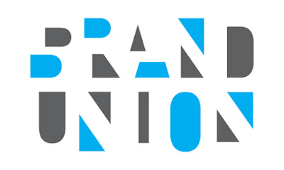
The London-based branding design company, Enterprise IG, part of the WPP Group, decided it was time to change their name and logo. Their solution is “The Brand Union.
Those of you who are students of logo design have seen lots of examples where letters are replaced by their negative spaces. Two triangles replacing the “N” is a pretty common device (I used it years ago for an architect’s logo). But this might be the first logo I’ve seen where every letter is replaced by its negative space (except maybe the “D” which you could argue is actually there even though the positive space is actually the filler inside the letter).
Funny thing is that the word “THE” isn’t there at all. But what I find more interesting is that the negative spaces of the letters are often offset — the parts of the “B” and the “A” don’t line up for example — which suggests that the designer and the company had great courage in presenting this design.
Does it work as a mark? More importantly, is it legible? Well it is to me, you’ll have to decide for yourself.